AI systems are creating huge amounts of data at a rapid rate. While this flood of information is extremely valuable, it is also difficult to analyse and understand. Organisations need to make sense of these large data sets to derive useful insights and make better decisions. Data visualisation plays a pivotal role in the interpretation of complex data, making it accessible, understandable, and actionable. Well-designed visualisation can translate complex, high-dimensional data into intuitive, visually appealing representations, helping stakeholders to understand patterns, trends, and anomalies that would otherwise be challenging to recognise.
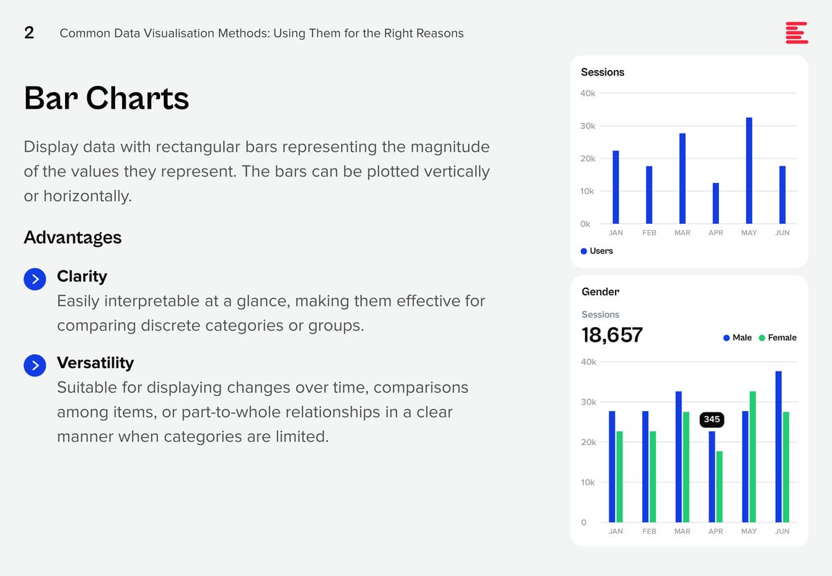
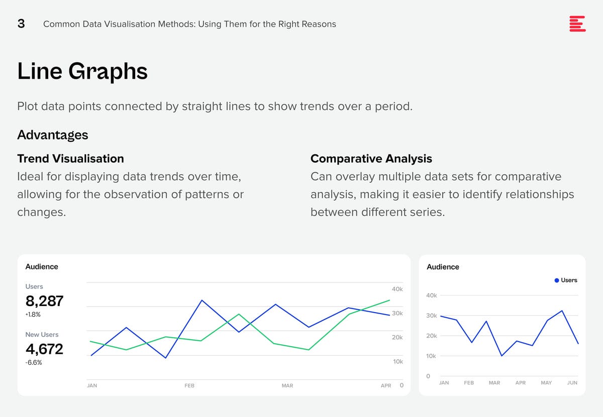
There are some data visualisation methods that you are using already; and some that you definitely should master as data complexity increases and there is more demand from business teams for better data visualisation.


Download Common Data Visualisation Methods as a PDF
Add These to Your Data Visualisation Repertoire
There are additional visualisation tools that you should be using to tell a better data story. Each of these visualisation techniques serves specific purposes in data analysis, offering unique advantages for representing data insights.
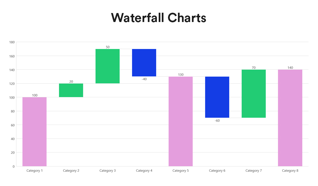
Waterfall charts depict the impact of intermediate positive and negative values on an initial value, often resulting in a final value. They are commonly employed in financial analysis to illustrate the contribution of various factors to a total, making them ideal for visualising step-by-step financial contributions or tracking the cumulative effect of sequentially introduced factors.
Advantages:
- Sequential Analysis. Ideal for understanding the cumulative effect of sequentially introduced positive or negative values.
- Financial Reporting. Commonly used for financial statements to break down the contributions of various elements to a net result, such as revenues, costs, and profits over time.
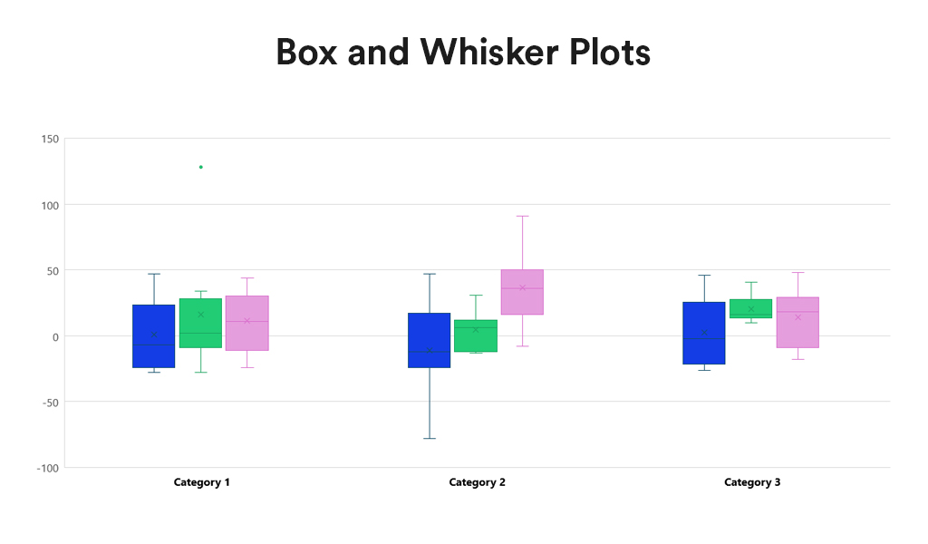
Box and Whisker Plots summarise data distribution using a five-number summary: minimum, first quartile (Q1), median, third quartile (Q3), and maximum. They are valuable for showcasing data sample variations without relying on specific statistical assumptions. Box and Whisker Plots excel in comparing distributions across multiple groups or datasets, providing a concise overview of various statistics.
Advantages:
- Distribution Clarity. Provide a clear view of the data distribution, including its central tendency, variability, and skewness.
- Outlier Identification. Easily identify outliers, offering insights into the spread and symmetry of the data.
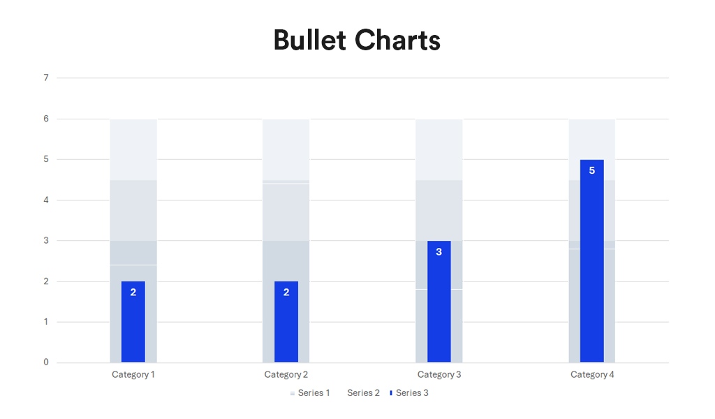
Bullet charts, a bar graph variant, serve as a replacement for dashboard gauges and meters. They showcase a primary measure alongside one or more other measures for context, such as a target or previous period’s performance, often incorporating qualitative ranges like poor, satisfactory, and good. Ideal for performance dashboards with limited space, bullet charts efficiently demonstrate progress towards goals.
Advantages:
- Compactness. Offer a compact and straightforward way to monitor performance against a target.
- Efficiency. More efficient than gauges and meters in dashboard design, as they take up less space and can display more information, making them ideal for comparing multiple measures.
Conclusion
Each data visualisation type has its unique strengths, making it better suited for certain types of data and analysis than others. The key to effective data visualisation lies in matching the visualisation type to your data’s specific needs, considering the story you want, to tell or the insights you aim to glean. Choosing the right data representation helps you to make informed decisions that enhance your data analysis and communication efforts.
Incorporating Waterfall Charts, Box and Whisker Plots, and Bullet Charts into the data visualisation toolkit allows for a broader range of insights to be derived from your data. From analysing financial data, comparing distributions, to tracking performance metrics, these additional types of visualisation can communicate complex data stories clearly and effectively. As with all data visualisation, the key is to choose the type that best matches the organisation’s data story, making it accessible and understandable to the audience.